Ceramic Balance
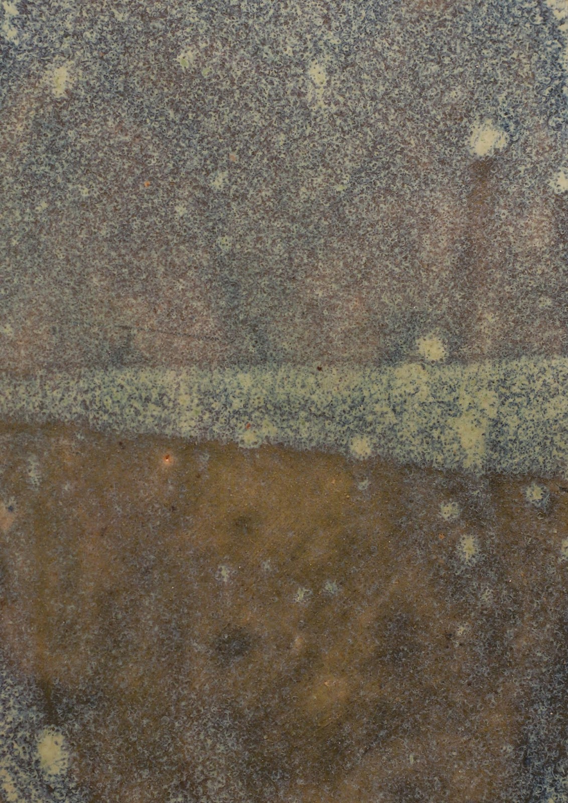
In this work, I created several clay tablets and explored the principles of balance using different glazes. I took photographs of sections from a selection of my tablets to create 3 abstract portraits. At first, these seem fairly simple, symmetric compositions, but closer inspection reveals a dynamic scape. In the first two, the colors and textures are largely consistent; however there is a division through half of each. The first is symmetric across this central axis, with a consistent texture but slightly differing color. The central line expands towards the right however, creating asymmetry across the vertical axis of the piece. In the second piece, the central line is a more proportional shape, but is slightly off-center, and has a more jagged edge. The break from perfect symmetry create a more dynamic composition that gives the eyes something to work for. As the authors put it, "asymmetrical designs are generally more active than symmetrical ones, and designers achieve balance by placing contrasting elements in counterpoint to each other, yielding compositions that allow the eye to wander while achieving an overall stability." The central division in the first work is created by overlapping glaze dips, while the second avoids contact between dips. The final piece doesn't contain a sharp division, but has a greater variety of texture and noise balanced by a color symmetry across the horizontal axis.


Comments
Post a Comment